Styling
When you select a layer in Sketch, you can create and edit its style properties in the Inspector.
Fills
Sketch support five different fill types:
- Solid Fill

- Linear Gradient

- Radial Gradient

- Angular Gradient

- Image Fill

By default, all new layers have a single, solid color fill.
How to Add a New Fill
To add a new fill, click  in the Fills panel. You can add as many fills as you like to a single layer and they’ll stack on top of each other. For each fill you create, you’ll have the following options:
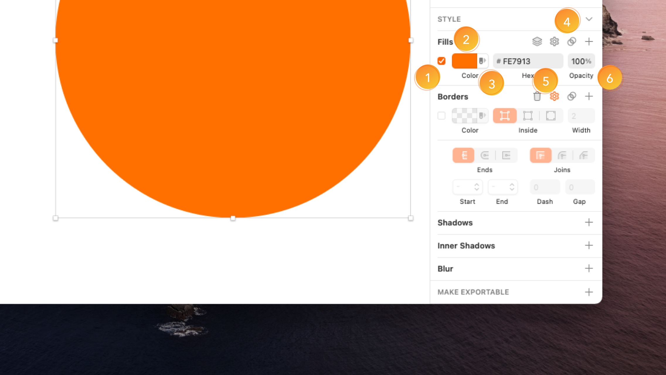
- Enable/Disable checkbox
- Color/Preview well. Click on this to select a different color or change the fill type. Read more about colors.
- Color Swatch
 . Click the icon and navigate through all the Color Variables in your documents and Libraries.
 - Blending Mode
 . Click the icon and select a blending mode. If you select anything other than Normal, the icon’s color will change to blue.
 - Fill Options. If you’re using a solid color fill, you’ll see that color’s HEX value here for easy copy and pasting. If you’re using a gradient or image fill, you’ll see options to change their type here.
- Opacity. Along with blending modes, you can change a fill’s opacity to combine and show two or more fill types.
Tip: Press F to toggle the visibility of all fills for any selected layer.
How to add an Image Fill
Click on the color well on a fill’s options and then click the image fill button on the right in the popover. Select your own image by choosing Choose Image…, pick one from the presets at the bottom of the popover, or click the Data icon  to select one from a data source.
You can then choose from four different fill types:
- Fill adjusts the size of the image to fit the layer’s width.
- Fit adjusts the size of the image to fit the layer’s height.
- Stretch fits the image to the layer’s height and width ratio by stretching it.
- Tile keeps the image at its original size, with the option to adjust this, and tiles it to fit the layer.
You can also click the clock icon  above the image preview to see frequently used images in your document, or choose a basic pattern or noise fills from the global presets at the bottom.
How to Change Fill Settings for Overlapping Paths
When you’ve applied a fill to a shape, click on the settings icon  near the Fills section title. From here you can choose whether to use the Non-Zero or Even-Odd rules to fill shapes, according to the winding rule.
The Color Popover
Click the color well for any fill, border or shadow to reveal the color picker popover.
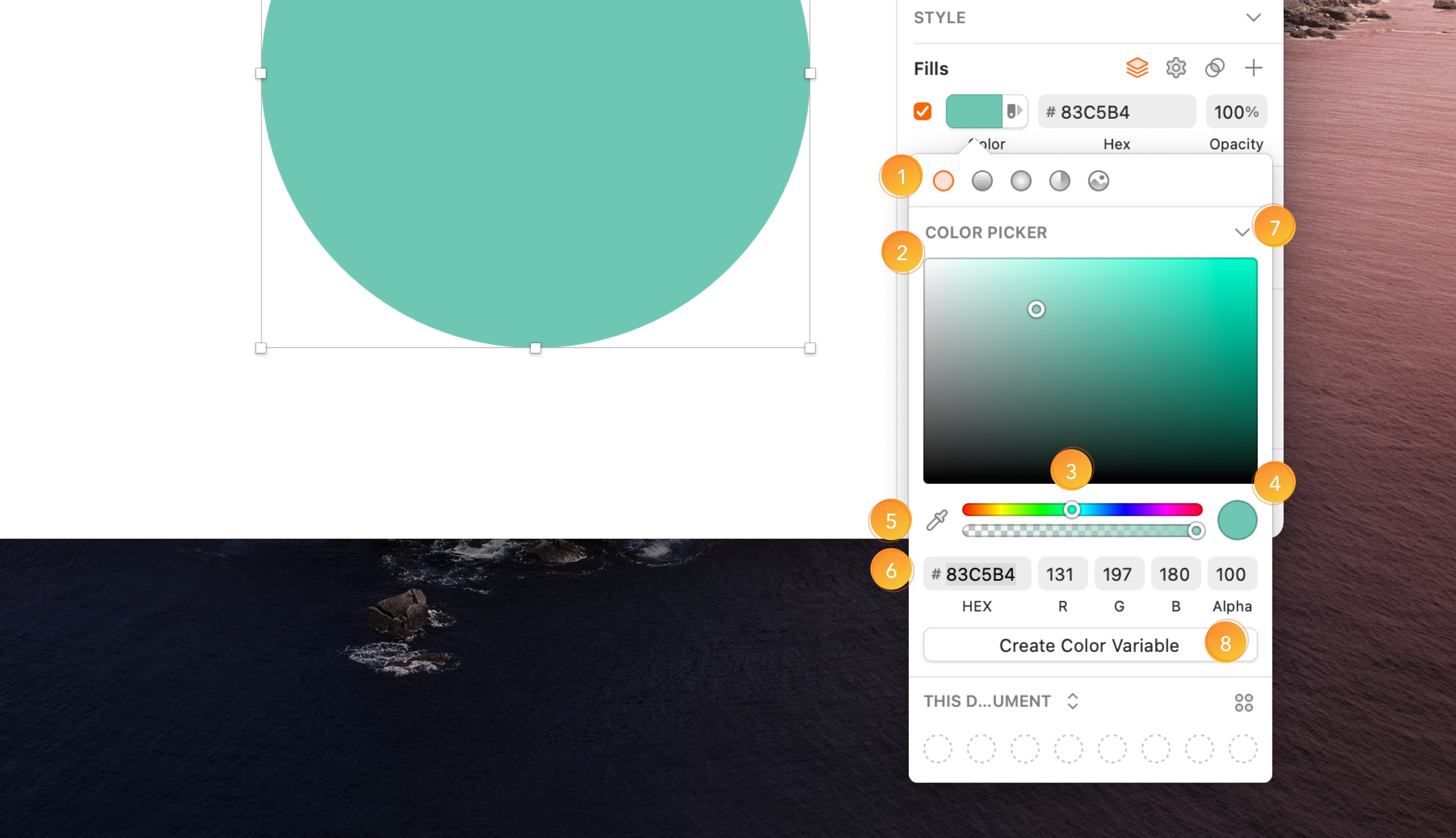
- The fill icons across the top switch between solid, gradient and image fills and change the color popover’s settings to match.
- The color picker uses the HSB (hue, saturation, brightness) color model. Drag the point left to right to change a color’s saturation, and up or down to change its brightness.
- The sliders control your color’s hue (color) and alpha (opacity).
- The preview shows the final result of your color settings.
- The eyedropper
 lets you pick any color from your display, inside or outside of Sketch. You can quickly access it by selecting a layer and pressing Ctrl + C. Tip: you can press Ctrl + C to bring up the eyedropper tool to set that layer’s fill color.
 - The text fields give you quick access to your color’s HEX value for copying and pasting, and the option to manually set a specific color using RGB (red, green, blue) and alpha values. You can click on the RGB labels to switch to HSB (hue, saturation, brightness) or HSL (hue, saturation, lightness).
- Create Color Variable saves a new Color Variable.
Note: When you edit a color’s HEX code in the Color Popover HEX field, its alpha value will return to 100%.
Color Variables
With Color Variables  , you can set colors that synchronize across your document. When you make changes to a Color Variable, those changes appear across all of the layers that use it. You can create Color Variables that are local to a specific document or share them in a Library to use in other designs.
- Color Variables can speed up your workflow and keep designs organized.
- They synchronize across your document. When you change a Color Variable it will update any layer that uses it.
- Any existing Global Color presets are now Color Variables and live in their own local Library.
We’ve also added support for Color Variables in Cloud Inspector, making them great for handoff.
How to Create a Color Variable
You can create a new Color Variable from the Inspector, from the Components View or from the Find and Replace menu.
Creating a Color Variable from the Inspector
Select any layer and click on the color well for any of its style properties in the Inspector. Select the solid color you want to use, then click on Create Color Variable. Give it a name and click on Create or press ↵ to save.
Creating a Color Variable from the Components View
Switch to Components View  , click on the Colors tab in the toolbar and then click on or Create Color Variable button. Pick the color you want using the Inspector and give your Color Variable a name. Click anywhere in the Previews Grid to save.
Organizing Color Variables
How to group Color Variables
To group your Color Variables, switch to Components View , go to the Colors tab, hold ⇧ and choose the Color Variables you want to group. Control-click on your selection, and choose Group. Then, you can double-click on the title of the group  in the left sidebar and rename it as you like. You can also drag Color Variables into existing groups in the left sidebar
  .
.
Like Symbols or Text Styles, you can also group Color Variables by using a / in their names. Anything before / will become the group name, and anything after will be the name of the Component within that group. For example, Primary/light and Primary/dark will become part of a group named Primary.
How to organize Color Variables in the Components View
Color Variables and groups will organize automatically in alphabetical order. You can use numbers in front of Color Variables so they appear in the order that works best for you.
Applying a Color Variable to a Layer
Applying a Color Variable from the Inspector
There are two ways you can apply a Color Variable from the Inspector. In both cases, you’ll need to select the layer where you want to apply a Color Variable. In the color well for any style property you can select the Color Variable you want from the grid. You can switch between the Color Variables for that document or any Library you have enabled. You can also apply a Color Variable by clicking on the color swatch icon next to the color well.
Applying a Color Variable from the Insert Window
Choose Window›Components to open the Insert Window or use the shortcut C in your keyboard. Click on the Colors tab in the top-left sidebar, then drag and drop the color swatch you want onto the layer you want to apply it to. You can also drop the Color Variable onto any color well in the Fills panel in the Inspector.
Applying a Color Variable from the Find and Replace menu
In the Find and Replace menu, click on the color well next to “Replace with”, and select the Color Variable you want to apply. Click anywhere to close the color picker, and hit Replace to update the colors.
How to edit Color Variables
You can edit Color Variables from the Inspector, the Components View or Find and Replace menu.
You can Control-click on any Color Variable, and choose to copy its HEX, RGB, HSL, Objective-C or Swift code color values to the clipboard.
Editing Color Variables from the Inspector
Select any layer, and click on a color well in the Inspector. Click on Edit Variable and pick a new color. Choose Update to save. Keep in mind you can only edit Color Variables that are local to your document. If you want to edit Color Variables from a Library, you will have to edit them in their Library document.
Editing Color Variables from the Components View
Switch to Components View and click on the Colors tab. Click on the color swatch you want to edit and choose the new color using the Inspector. Changes will preview and save automatically.
How to rename a Color Variable
To rename a Color Variable, switch to the Components View and click on the Colors tab. Then, select the color swatch you want to rename. Under the Name section in the Inspector, type your new name. Your changes will save automatically. You can also Control-click on the color swatch and choose Rename.
How to delete a Color Variable
To delete a Color Variable, switch to the Components View, and click on the Colors tab. Select the swatch of the Color Variable you want to delete and hit backspace. You can also Control-click on the color swatch and select Delete.
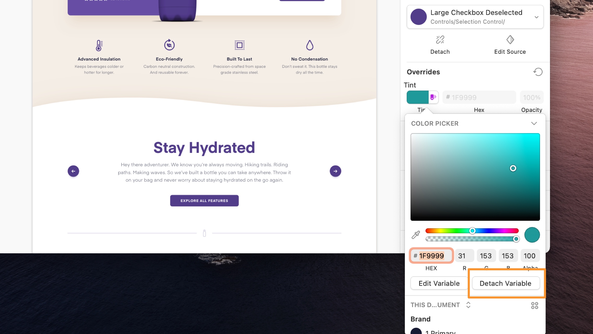
How to detach a Color Variable
You might want to make changes to the color of a single layer that uses a Color Variable without updating the Color Variable itself. In this case, you’ll want to detach that Color Variable first.
To detach a Color Variable from the Inspector, select the layer where you want to detach the Color Variable from, click on the color well in the Style menu in the Inspector, and click Detach Variable.
How to Find and Replace a Specific Color or Color Variable
Choose Edit > Find and Replace Color… (or press ⌘ + ⌥ + F) to bring up the Find and Replace Color menu. From there, select the color or Color Variable you want to find within your design and the color or Color Variable you want to replace it with.
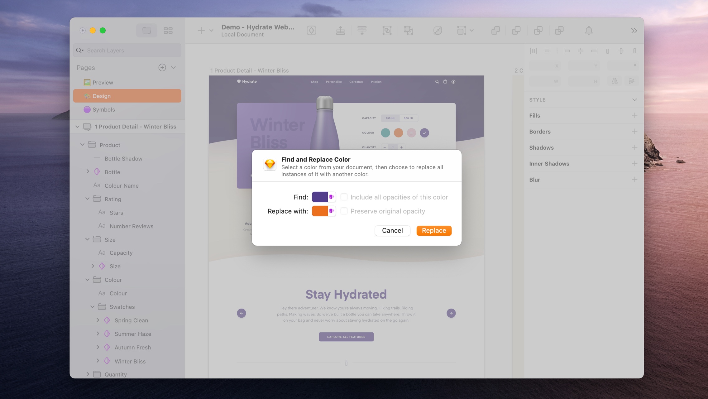
Enable “Include all opacities of this color” to find all colors with different alphas, but the same RGB or HEX values.
Enable “Preserve original opacity” to keep those different alphas intact when you replace the color.
Note: We’ve released a Color Variables Migrator plugin that makes it easy to apply Color Variables to Layers and Styles in older documents.
Presets
At the bottom of the color popover, you can store gradient or image fill presets for quick access and reuse within your document or as part of a Library. Previously, solid Color Presets would also appear here, but these are now Color Variables.
How to Add a Preset
To add a preset, select your gradient or image fill, choose whether you’d like to add it to your global (all documents) or document (this document only) presets, then click the icon.
To rename your preset, make sure you’re viewing your presets in list view  , Control-click on it and choose Rename. You can also Control-click and choose to move or copy your preset between the global or document locations.
You can drag presets to reorder them, or drag them completely out of the color popover to delete them (or Control-click on them and choose Delete).
How to create Library Presets
When you save a document preset and make that document a Library, it’ll appear below the Global and Document items in the presets menu to anyone who’s added the Library.
Any presets that have been updated in a Library you’ve added will show a small dot to indicate when they’ve been updated.
Gradients
To apply a gradient fill to a layer, click the color button under the Fills section of the Inspector, then choose either the linear , radial or angular gradient buttons at the top of the popover.
How to Create Linear Gradients
With a linear gradient , Sketch adds a line with two points to your layer.
To change a color on your gradient, click on either point and select a color using the color popover in the Inspector. To add another color to your gradient, click anywhere on the gradient line to add a new point.
Drag the color points to change the look of your gradient. Or select a point and press backspace to delete it.
How to Create Radial Gradients
Editing radial gradients is similar to editing linear gradients except that one of the points now sets the middle of the effect and its opposite point sets where the effect ends. By dragging the non-color point, you can control the size of the effect.
How to Create Angular Gradients
Angular Gradients place any color points you create on a circle (based on the maximum height or width of a layer). You can drag the points to adjust their position or click on the circle to add new points.
How to Use the Gradient Bar
Along with the gradient points on your layers, you can use the gradient bar in the color popover to adjust and control your gradient. It works in exactly the same way. Click a point to change its color and drag it to move it, click anywhere on the bar to add a new color, or select a point and press backspace to remove it.
How to Adjust Gradient Points with Shortcuts
You can use the following shortcuts to adjust your gradient:
| 1 - 9 | Position a new color point along the gradient bar (e.g. 3 = 30% along. |
| = | Positions a gradient point equally between two other points. |
| Tab | Switch between color point. |
| → or ← | Adjust the color point position incrementally. |
| ⇧ + → or ← | Adjust the color point position in larger increments. |
Borders
You can add as many borders as you like to your layers, with different thicknesses, colors and blend modes.
Borders can be a solid color , or have a linear , radial or angular gradient fill.
Tip: You can quickly show or hide borders on any layer by pressing B.
How to Set a Border Position
For closed shapes, you can place borders on the inside  , outside
  or center
  of its outline. For open paths, the only option is center.
Border options (left to right): Inside, Center, Outside.
How to Customize Borders
Click the settings icon next to the Borders title to bring up options for caps, ends, arrows and dashed borders:
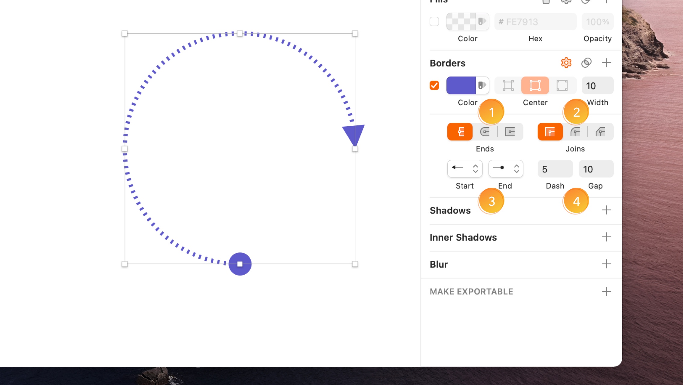
-
For line layers and open paths, you can choose from three types of border end: Butt cap
 (Draws the border right to the vector point), Round cap
  : (Creates a rounded, semi-circular end to a path that extends past the vector point) or Projecting cap
  (Similar to the rounded cap, but with a straight edges).
 -
For open and closed paths with three or more points (creating corners) you can choose from three types of join: Miter join : (Creates an angled join), Round join
 : (Creates a rounded corner for the border with a radius relative to the border thickness) or Bevel join
  (Creates a chamfered edge on the border corner).
 -
For line layers, you can choose arrowheads for the start and end of the path using the drop-down menus. To switch which ends they appear on, choose Layer > Path > Reverse Order.
-
To create dashed lines, enter a value in the Dash field to set the length of the dashes. The Gap field, which sets the distance between dashes will automatically match this unless you set it to something different. To reset the the Gap value and have it match again, delete anything in that field.
Tip: To create a dotted line, set the end type to a round cap , then set the dash value to 0. Adjusting the gap distance will change the look of your dotted border.
Tints
Tints apply a single color to an entire group or Symbol. Unlike Fills, Tints respect semi-filled elements with different opacities and borders. They’re great for things like complex icons, or tabs in a navigation bar, where you want to show different states through a change in color.
Note: The option to add a Tint is only available when you select a group of layers or a Symbol instance.
How to apply a Tint
To apply a Tint to a group or Symbol instance, click the icon in the Tint panel in the Inspector. Tints work in a similar way to fills, so you’ll be able us the Color Picker or enter a hex code and change the overall opacity. However, you can only select a solid color to use as a Tint.
In this example, the semi-filled parts of the icon still have take on the Tint color, but with a lower opacity that reflects their original design
How to use Tints as Overrides
To use Tints as Overrides with nested Symbols, you’ll first need to apply a default tint to any Symbol instances on the Symbol Source you’re working with.
For example, in the case of a tab bar where each tab is its own nested Symbol, you’ll need to head to the tab bar Symbol Source and apply a tint to each tab Symbol instance.
Now, when you view your tab bar Symbol instance  , you’ll see a color icon to the right of each nested Symbol’s name in the Inspector. Clicking on this will bring up the Color Picker so you can override the default Tint for each Symbol.
Shadows
Shadows and Inner Shadows have the same controls but work in different ways. Shadows render outside a layer, while Inner Shadows render inside a layer.
You can apply multiple shadows to the same layer, and control their colors, blending modes, X and Y positions, blur radius and spread.
Note: When you zoom out about 400%, shadows with a blur value will not show on the Canvas. This is to make sure documents using lots of shadows render quickly. This won’t affect any assets you export.
Blurs
To add a blur to your layer, click the Blurs title in the Inspector and then choose a blur type from the drop-down menu:
Gaussian Blur applies a blur in all directions. You can set the blur amount using its slider.
Motion Blur blurs in one direction to imply motion. You can set both the blur amount and the angle using the sliders.
Zoom Blur will blur from one point outwards. You can set both the blur amount and the point where it starts from.
Background Blur replicates the blurs behind overlays and panes in macOS and iOS. Content underneath your layer will blur and you can set that content’s saturation and a blur amount in the Inspector. If you have any fill styles on this layer, they’ll need to be transparent in order to see this blur. A transparent color fill is also a great way to tint it.
Note: Applying lots of blurs (or large blurs) can cause Sketch to slow down as they require lots of memory and processing power to render them.
Text Styles
With Text Styles  , you can store a set of styles and reuse them across different text layers within your designs. When you make changes to a layer that you’ve applied a Text Style to, you can choose to update the Text Style itself so that all text layers with that Text Styles change as well.
How to Create a Text Style
Select a text layer that you’ve applied styles to, then choose Layer > Create new Text Style from the menu. You can also click the Create button under the pop-up menu that reads No Text Style in the Appearance panel in the Inspector. Type in a name for your new Text Style and press enter to save it.
You can also create a Text Style from the Components View. With the Text Styles tab selected, click on the or Create Text Style  in the toolbar then edit its style properties in the Inspector.
How to Apply a Text Style
Select a layer and choose the pop-up menu that reads No Text Style under the Appearance panel in the Inspector, then in the Components Popover, select the Text Style you want to apply. You can use the search bar  at the top of the popover to help you find the style you need.
You can also apply a Text Style using the Insert Window. Press C to open the Insert window or choose Window›Insert in the menu. From there, click on the Text Styles tab and select or search for the Text Style you want to insert. Drag and drop it onto any Text Layer to apply it or drop it onto an empty space on your Canvas to create a new Text Layer.
You can also insert a Text Style from the Components View by selecting a Text Style and choosing Insert Text with Style in the Inspector.
How to Edit a Text Style
Select a Layer and make sure you’ve applied the Text Style you want to edit, then make your changes to its styles. Once you’ve done this, you’ll see an asterisk (*) appear next to the Text Style’s name. From here, you can click on one of the following buttons in the Appearance panel:
- Update will apply your changes to this layer and to any other layers using the same style.
- Create will create a new Text Style with your changes applied to it.
- Detach
 will keep the changes you’ve made to that layer but remove the Text Style.
 - More (…) will give you the option to reset a style (if you’ve made a change) or rename it.
You can also Edit Text Styles in the Components View . Switch to the Components View and click on the Text Styles tab in the toolbar. Choose the style that you want to edit and make your changes. Any changes you make will automatically apply across layers that use that Text Style in your document.
Tip: You can include Text Styles a part of a Library for sharing with others. Take a look at Library Styles for more details.
Layer Styles
Layer Styles  work in exactly the same way as Text Styles . The only difference is that they work with shape layers, while Text Styles work with text layers. To create a Layer Style, select a shape Layer that you’ve applied styles to, then choose Layer > Create new Layer Style from the menu. Alternatively, open the Components View and choose / Create Layer Style from the toolbar. Editing and applying Layer Styles follows the exact same process as Text Styles.
Tip: You can include Layer Styles a part of a Library for sharing with others. Take a look at Library Styles for more details.
How to Insert a Text or Layer Style as a New Layer
Inserting a Text or Layer Style as a New Layer via the Insert Window
You can insert a Text or Layer Style as a new layer using the Insert Window. Press C to open the Insert window or choose Window›Insert in the Insert menu  . Select the Layer or Text Styles tab. Then, choose or search for the style you are looking for. Drag and drop onto the Canvas to create a new layer.
Inserting a Text or Layer Style as a New Layer via the Components View
To insert a Layer Style or Text Style from the Components View, select the component you want to insert as a new layer and click on Insert Shape with Style or Insert Text with Styles in the Inspector.
You can also choose Insert in the toolbar and select the Text Style or Layer Style you want to use. Then click anywhere on your Canvas to insert the new text or shape layer.
Organizing Styles
How to Create Style Groups
To group styles together in the Components View and Insert menu , name them using the format: Group-name/Style-name. For example, two Symbols named Background/Light and Background/Dark will be places in a group called Background.
Organizing Styles in the Components View
You can organize your Text, Layer Styles and Color Variables in the Components View. To group several styles together hold ⇧ and select the styles you want to group. Control-click on any of the styles and choose Group in the contextual menu. Give a name to the new group by double-clicking on the new group that you’ll find in the left sidebar of the Components View.
To group styles together in the Components View and Insert menu , name them using the format: Group-name/Style-name. For example, two Symbols named Background/Light and Background/Dark will be places in a group called Background.
You can also add a style to an existing group by dragging it into the group icon in the left sidebar.
Note: For Sketch 60 and earlier, you need to have two or more styles in a group before they’ll appear in their own submenu.
To rename a specific style, select the style and give it a new name in the Inspector. To rename an entire group, double click on the group name in the left sidebar and add a new name to the group.
Styles are ordered alphabetically in the Components View.
Tips and Tricks
How to Adjust a Layer’s Opacity
As well as dragging the opacity slider, or typing a percentage in the field next to it, you can quickly set a layer’s opacity, by selecting your layer and pressing 0-9 (e.g. 3 for 30% opacity). Pressing two numbers quickly will set a more exact opacity (e.g. 2 and 5 for 25% opacity).
Pressing single digits reduces this layers opacity to 90, 80 and 70%, then pressing 7 and 5 quickly changes it to 75%.
How to Organize Style Properties
Click on the drag on the space between a style property’s controls to move it above and below other properties.
Check or uncheck the checkbox next to each style property to enable or disable it. If you make an adjustment to a disabled style property, this will enable it.
To remove a style property altogether, click and drag it out of the Inspector, Control-click on it and choose Remove, or click on  at the top of the panel (if it’s disabled).
How to Copy and Paste Styles
Select the layer you want to copy styles from, then choose Edit > Copy > Copy Style (or press ⌘ + ⌥ + C). Then select the layer you want to paste those styles to and choose Edit > Paste > Paste Style (or press ⌘ + ⌥ + V).