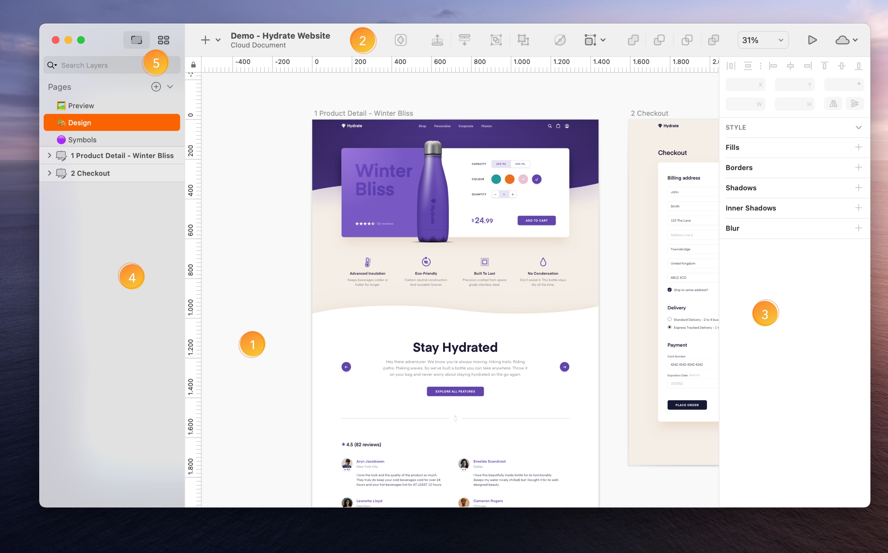
The Interface
-
The Canvas. The Canvas
 is where you create your designs. It’s infinite, so you can set things up however you like and work directly on the Canvas itself without worrying about running out of space. If you’d prefer to work within a fixed frame, you can add Artboards to your Canvas. Read More →
 -
The Toolbar. The toolbar provides quick and easy access to important tools and actions you’ll use a lot in Sketch. It comes with a handy set of defaults but you customize it with different buttons to suit your needs. To do so, control-click on it and choose Customize Toolbar… or choose View > Customize Toolbar…. Read More →
-
The Inspector. In the Inspector, you’ll find settings for any layers you’ve selected, or controls for the tool or feature you’re using. Read More →
-
The Layer List. In the Layer List, you can see and select from all of the pages in your document, and see the Artboards and layers on each page. Read More →
-
The Components View
 . In the Components View you’ll find all the Symbols, Text Styles, Layer Styles, and Color Variables in your document. You can create, manage, search and find all components in the Components View. Read More →
Tip: To hide the Sketch UI, and view just your work on the Canvas, choose View > Hide Interface in the menu (or press ⌘ + .) to toggle Presentation Mode.
The Canvas
How to Zoom and Navigate the Canvas
You can hold the spacebar and click and drag to pan around the Canvas, or use the arrow keys if you haven’t selected any layers.
To zoom in and out, you can hold the ⌘ key and use your mouse’s scroll wheel, use the pinch gesture on a trackpad or use the Zoom menu in the toolbar. You can also use the Zoom tool by pressing Z and either clicking to zoom in or holding ⌥ and clicking to zoom out. With the Zoom tool enabled, you can click and drag a selection to zoom into a specific area.
There are also a few Zoom shortcuts:
| ⌘ + + | Zoom In |
| ⌘ + - | Zoom Out |
| ⌘ + 0 | Zoom to 100% |
| ⌘ + 1 | Zoom to see the whole canvas |
| ⌘ + 2 | Zoom to selected layer(s) |
| ⌘ + 3 | Center selected layer(s) on the canvas |
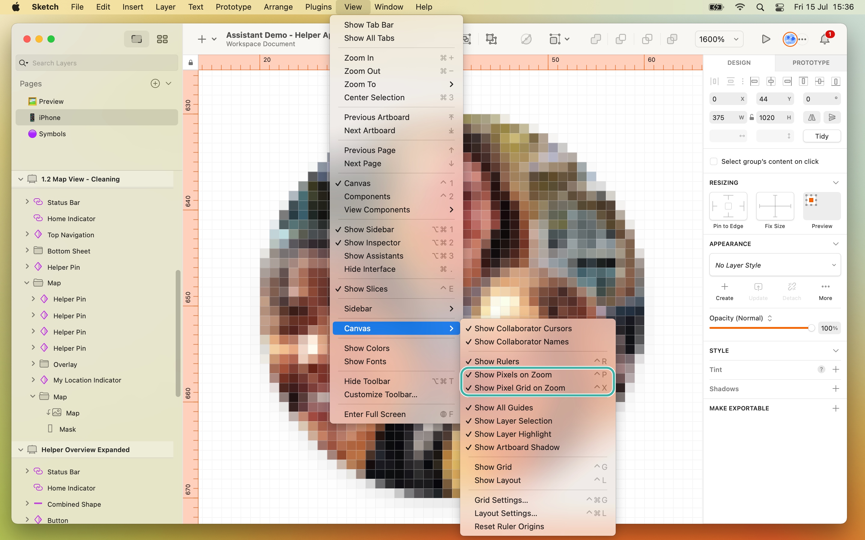
How to Show Pixels on the Canvas
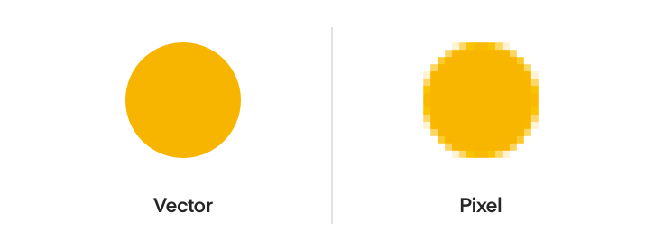
By default, you’ll view Sketch’s Canvas in vector mode. It’s resolution independent and you can zoom infinitely to work at any level of detail.
If you’re working on a design where it’s important to be able to see individual pixels, select View > Canvas > Show Pixels on Zoom or press Ctrl + P to enable Pixel Zoom and view individual pixels when you zoom in past 100%.
How to Show the Pixel Grid
Select View > Canvas > Show Pixel Grid on Zoom, or press Ctrl + X, to see any edges of your layers that don’t align with the Pixel Grid once you zoom in past 600%.
How to use Rulers and Create Guides
Sketch hides rulers by default, but you can show them by selecting View > Canvas > Show Rulers or pressing Ctrl + R.
You can click and drag on your rulers to set their zero origin anywhere you like on the canvas. To lock them in place, click the lock icon in the corner. To reset your rulers’ origins, choose View > Canvas > Reset Ruler Origin
Clicking the lock icon will stop any accidental ruler movements.
You can click anywhere on a ruler to create a guide. Guides will be visible when your rulers are and if you move a layer on your Canvas it will snap to the nearest guide.
You can move a guide by clicking and dragging on it inside a ruler. To remove it completely, drag it right towards the Layer List or Inspector until your cursor changes. You’ll see that the guide disappears.
To remove all of your guides together, Control-Click one of the rulers and select Remove All Vertical Guides or Remove All Horizontal Guides, respectively.
How to Create Grids
Sketch supports two types of grid; a regular (square grid) and a layout grid. You can view both at the same time if you need to.
To set up a square grid, choose View > Canvas > Show Grid or press Ctrl + G. To change its settings (the size of the cells, how often thicker lines appear and the color of the lines), choose View > Canvas > Grid Settings….
To set up a layout grid, choose View > Canvas > Layout Settings… and use the options that appear to choose the number of columns and rows, their widths, gutter widths and colors.
You can only apply grids to Artboards, or to the Canvasw if there aren’t any Artboards on it. You can edit the layout options for multiple Artboards at the same time.
When you have a layout grid set up, layers will snap to it and ignore Sketch’s Smart Guides.
Tip: To hide and show layout grids, press Ctrl + L on your keyboard.
Measuring
To measure the distance between different layers on the Canvas, select the first layer, then hold ⌥ and hover over the layer you want to measure against. To measure against a layer that’s inside a group, you’ll need to ⌘ as well.
If you’re measuring the distance to a text layer, holding ⌥ will measure to the text’s bounding box. Holding Ctrl will measure to the text’s baseline (from the bottom) or cap height (from the top).
You can change the colors of Sketch’s measuring guides via the Canvas tab in Preferences.
How Snapping and Smart Guides work
As you move or insert layers and Symbols on the Canvas, Sketch will automatically show you measurements against nearby layers, as well as Smart Guides that help you snap to a nearby layer’s centre or edges.
If you have two or more layers next to each other, and move another near to them, Sketch will highlight their distance and automatically snap that layer to distribute them all equally.
When you resize a layer, if there are similar layers nearby Sketch will show you if they have a similar width or height. This also works when you’re resizing a layer that’s overlapping another.
Finally, when you insert or move text layers, they’ll snap to the height or width of nearby layers. Adjust the height of a text layer will also snap the bounding box to the last line of text.
The Toolbar
The Toolbar is where you’ll find quick shortcuts to important tools and actions you’ll use a lot in Sketch. You can customize the toolbar with different buttons to suit your needs. Simply Control-click on it and choose Customize Toolbar… or choose View > Customize Toolbar…. Here’s a rundown of the default toolbar:

- Canvas and Components View Switch allows you to quickly switch between the Components View and the Canvas .
- Insert
 gives you quick access to the different layers you can add to the Canvas.
 - Create Symbol
 converts a group or layer you’ve selected into a reusable Symbol. You’ll be able to choose a name and Layout options when you create a Symbol. Find out more about Symbols.
 - Forward
 , Backward
  , Group
  and Ungroup help you organise your layers and move them within the Layer List.
 - Edit
 and Tools
  give you quick access to common actions for editing layers.
 - Union
 , Subtract
  , Intersect
  , and Difference
 ") give you quick access to Sketch’s four boolean operations.
give you quick access to Sketch’s four boolean operations. - View changes how your designs appear on the Canvas and what you’re focused on.
- Preview
 shows your design or prototype in the Preview window. Find out more about Prototyping.
 - Cloud
 lets you share your document on Sketch Cloud. Find out more about Sketch Cloud.
 - Notifications
 let you know about Library updates or missing elements in your document. The notification icon will disappear until you receive new notifications.
You can also toggle between hiding and showing the toolbar by pressing ⌘ ⌥ T or by choosing View > Show/Hide Toolbar in the Menu Bar.
The Inspector
In the Inspector, you’ll find settings for any layers you’ve selected, or controls for the tool you’re using. The Inspector hides and shows these controls and settings based on what you have selected or what you’re doing.
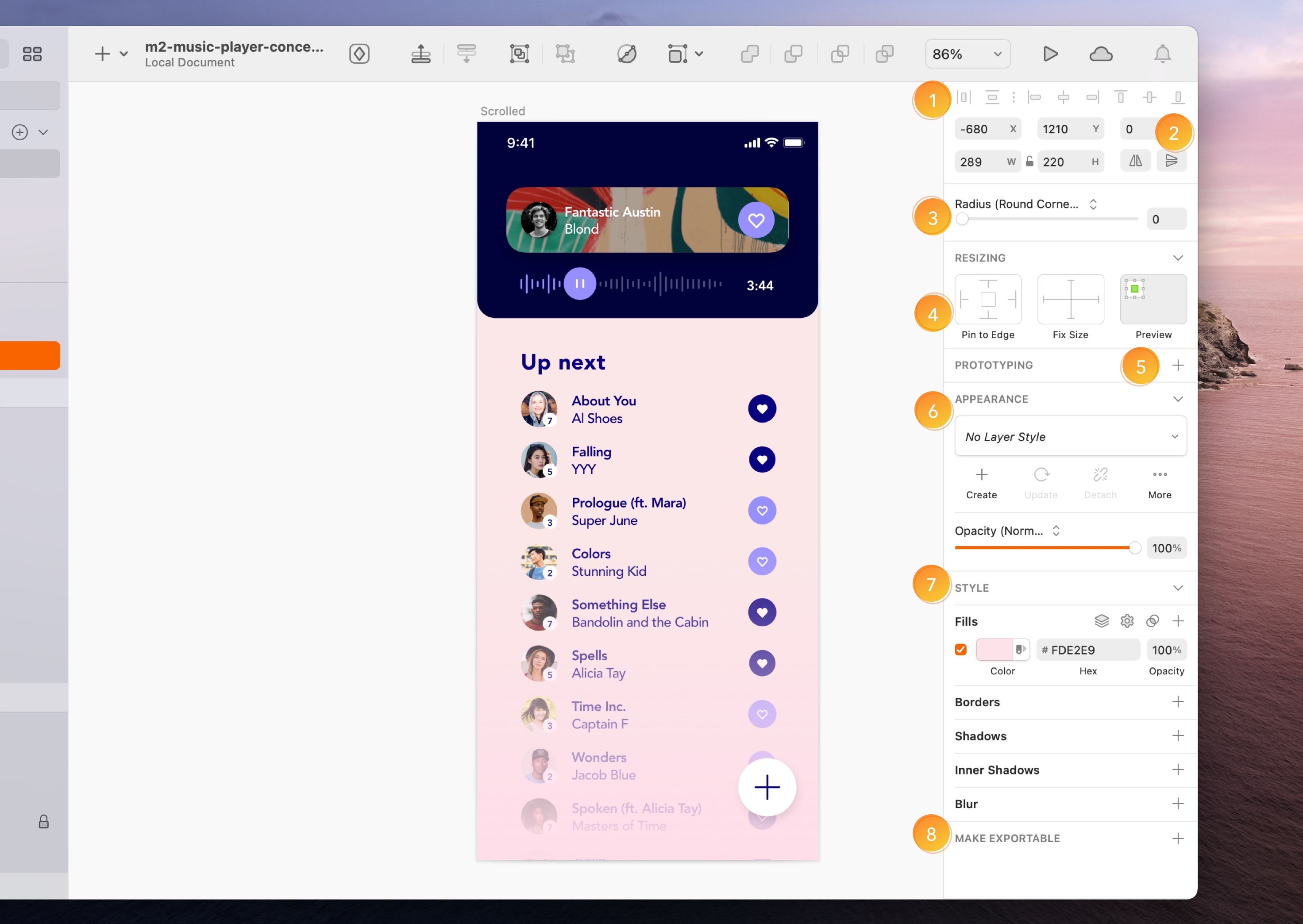
- Alignment Options. These become active when you select two or more layers. Read more about aligning layers.
- Layer Properties. These controls let you change the position, size and rotation of layers, as well as flip them.
- Radius. You can choose to round or smooth corners in rectangles or squares. Read more about Editing Radius.
- Resizing Constraints. You’ll see these controls if you’ve selected a layer within a group or Artboard
 . Read more about Resizing Constraints.
 - Prototyping. These controls allow you to add target Artboards in your Prototypes, animate your interactions and fix a layer’s position when scrolling.
- Appearance. You can use the Appearence controls to create, update, or detach your Layer Styles
 . Read more about Layer Styles.
 - Styling. The Styling tools let you control how your layers look. To add a new Style, click the add button next to the section title for the style you want to use. When you’ve added styles, you can hide them by deselecting the checkbox next to them. To remove a style altogether, deselect its checkbox and click the trash icon that appears. Read more about Styling.
- Exporting. Read more about Exporting.
The Layer List
In the Layer List, you’ll find all the Pages, Artboards and layers in your document. You can reorder and rename all of these from here.
How to Hide and Lock Layers
To hide a layer, hover over its name in the Layer List and click the eye icon that appears. If there’s an eye icon  next to a layer before you hover it, the layer is already hidden. You can also use ⌘ + ⇧ + H to toggle hiding and showing layers.
To lock a layer, hold ⌥, hover over a layer and click the padlock icon  that appears. Click the padlock to unlock it. Or use ⌘ + ⇧ + L to toggle a layer’s lock on and off. When you lock a layer, you won’t be able to edit or move it.
How to Use Pages
You can use as many Pages as you like in your Sketch document. They’re handy for organizing your work, as well as improving Sketch’s performance with complex documents.
To create a new Page in Sketch, click on the add button  at the top of the Layer List, and give your new Page a name.
Click on the Page you want in the Layer List to navigate to it, or press Fn + ↑ or Fn + ↓ to jump between them.
You can also collapse your list of Pages using  and use a drop down menu to navigate between them instead.
You can drag Pages to change their order, or Control-Click on a Page to duplicate or delete it.
Once you’ve created pages, you can drag Artboards or layers within the Layer List from one Page to another in the Pages panel.
How to Use Artboards
Artboards are completely optional, but handy for creating fixed frames on the Canvas to create your work in. They’re especially useful if you’re designing for a specific device or screen size.
To create an Artboard, choose Insert > Artboard from the toolbar or menu bar, or press A. You can either click and drag on the Canvas to create a custom size Artboard, or choose a preset from the Inspector.
To save a custom size Artboard as a preset, click the Add button  at the bottom on the Inspector and give it a name.
After you create an Artboard, you can press ⌘ + D to duplicate it.
How to Move Artboards
To move an Artboard, you’ll need to select it. If it doesn’t have any layers inside it, you can click anywhere on it. If it does, you’ll need to click its title on the Canvas, or select it in the Layer List. You can then drag it around the Canvas, use the arrow keys to move it, or change its X and Y values in the Inspector.
How to Resize Artboards
To resize an Artboard, select it and then click and drag on the selection handles that appear around it. You can also edit its dimensions in the Inspector.
You can also set an Artboard to resize its contents at the same time by selecting Adjust contents on resize in the inspector. You’ll need to make sure you’ve set up resizing contraints for the layers within it first, though.
Finally, you can set your Artboards to automatically resize to fit their contents by selecting Fit in the inspector.
How to Delete Artboards
To delete an Artboard, select it and press backspace on your keyboard. Doing this will also delete any layers within it. If you want to keep an Artboard’s contents but delete the Artboard itself, select it and choose Ungroup  from the toolbar, or press ⌘ + ⇧ + G.
How to Search the Layer List
If you have a document with lots of layers, you can use the search bar  at the top of the Layer List to find a specific layer type. You can also use the search bar to find a layer by name.
Tip: Layers with long names will be truncated in the Layer List. Hover over any truncated layer name to see it in full in a tooltip.
The Components View
The Components View is a quick and easy way to create, manage, search, and find local Symbols, Text Styles, Layer Styles, and Color Variables in your document.
How to Access the Components View
To access the Components View click on the Components tab on the left side of the toolbar (you can also use Ctrl+1 and Ctrl+2 to toggle between the Canvas View and Components View, respectively).
The buttons in the centre of the toolbar filter the view between the four types of Components: Symbols, Text Styles , Layer Style , and Color Variables.
Working in the Components View
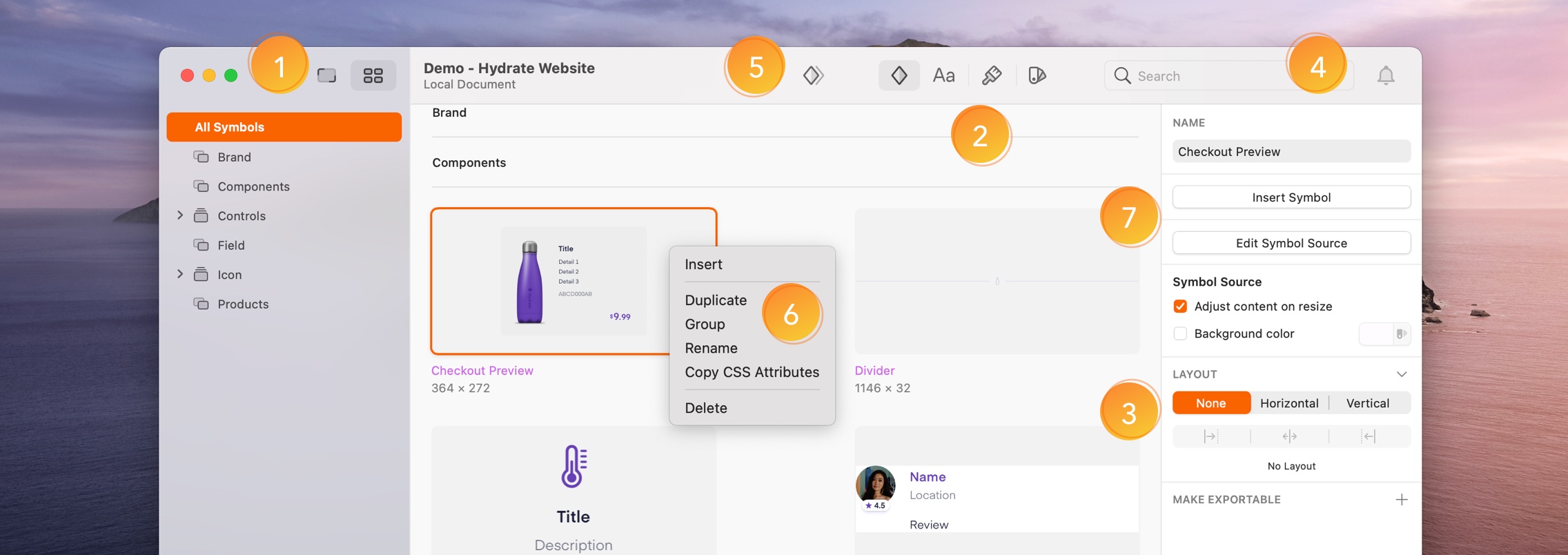
- Switching Views. Switch between the Canvas and Components View by toggling between the two tabs on the left of the toolbar. Or use Ctrl+1 and Ctrl+2.
- Filtering Components. By default, we’ll show you all the Symbols in your document, but you can use the toolbar controls to switch between Symbols, Layer Styles, Text Styles and Color Variables.
- Editing in the Inspector. You can edit, rename or delete any Symbol, Layer Style, Text Style or Color Variable using the Inspector. Simply select a component and make your changes.
- Search
 . Filter between Component types using the tabs, then search for the name of the Component.
 - Duplicate
 or Create new . To create a new Layer, Text Style or Color Variable, click on the toolbar item. You can also duplicate Symbols using the duplicate icon in the Toolbar.
 - Contextual Menu. Control-click on the Component thumbnails to insert, rename, group, duplicate, delete, or copy their CSS attributes.
- Insert . Use insert to add a copy of your select Component to your Canvas. When you pick a Component and click the Insert button, Sketch will switch to the Canvas view, so you can drop your Component into your design.
This view is all about organizing, so it only shows Components that are local to the document you have open. It doesn’t show Components from Libraries, even if you’ve used them in your document. You’ll need to open the original Library Sketch file to manage that Library’s Components.
How to Create a new Component using the Components View
You can quickly create new Text, Layer Styles, and Color Variables from the Components View. Although the process to create different types of Components is fairly similar, check each Components guide to creating a new one:
While you can’t create a Symbol  in the Components View , you can duplicate it. Click on Edit Symbol Source in the Inspector to edit on the the Symbols page.
Organizing Components
The Components View makes it easy to organize and manage your Components.
You can select multiple Components and group them using Ctrl+G or Control-click on your selection and choose Group  . You can also drag and drop Components into existing groups in the left sidebar. To rename a group, double-click on the group name in the left sidebar. To rename a single Component, click on it, and rename it using the name field in Inspector.
How to Expand and Collapse Groups
You can quickly collapse all open groups by choosing View > Sidebar > Collapse All Groups. For more granular control, you can hold ⌥ when you click on a disclosure arrow next to a group’s name to open and collapse  all contents within that group (including sub-groups).
By default, all groups are expanded, but you can change this setting by choosing View > Sidebar and toggling the Automatically Expand Groups item. Note: These options only apply to items in the Layer List.
The Insert Window
The Insert Window opens separately to the main window. It gives you a fast and easy way to find and insert Symbols, Text Styles, Layer Styles and Color Variables – from your document or any of your Libraries. Each Component gets a big preview, which you can drag and drop onto your Canvas.
Use the keyboard shortcut C to open the window or choose Window›Insert in the menu. In the window, you can toggle between Components in the sidebar of the window, and filter between Libraries and local Components.
To open the Insert Window, use the keyboard shortcut C to open the window or choose Window›Insert in the menu.
Navigating the Insert Window
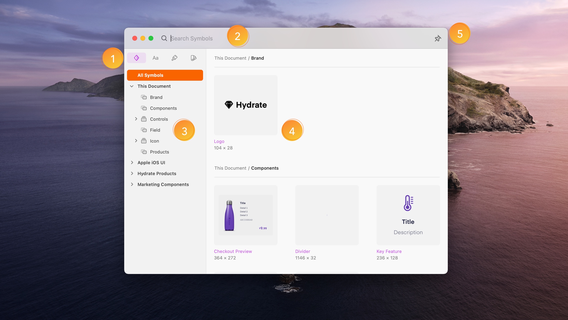
- Component Tabs. Filter between Symbols, Layer Style, Text Styles and Color Variables.
- Search bar. When you search in the Insert Window you’ll see results for the Component type you’ve selected in the sidebar, so be sure to select the relevant Component type first.
- Sidebar. Quickly navigate between different Libraries and groups to filter the previews on the right.
- Previews Grid. Each Component gets a big preview. You can drag and drop any of them straight onto your Canvas. Try dragging Color Variables onto shapes, or Text Styles onto Text Layers.
- Window pinning. By default, when you start dragging a component onto your Canvas, the Insert Window unfocuses and hides itself behind your document window so you get a full view of your design. To have the Insert Window immediately reappear as soon as you’ve finished dragging a component, simply click the pin icon.
How to insert Components from the Insert Window
You can browse or search for any Symbol, Text Style, Layer Style, or Color Variable. When searching, you’ll see results for the Component type you’ve selected in the sidebar, so be sure to select the relevant Component type.
Select the Symbol, Text Style, Layer Style or Color Variable that you are looking for, and drag and drop it onto your Canvas.
You can also drag and drop Symbols and Text Styles on top of overrides to apply them. When inserting Color Variables onto a Text or Layer Style, drop the Color Variable right on top of the layer you want to apply it to or drop it on any color well in the Fills panel in the Inspector.
Tip: You can switch between Component types using ⌘+1, ⌘+2, ⌘+3, ⌘+4.