Symbols
Symbols  can speed up your workflow by giving you a way to save and reuse common elements across your designs. When you make changes to a Symbol, those changes appear everywhere you use it in your designs. You can even create overrides for specific parts of individual Symbols.
Creating a Symbol
To create a Symbol, select a group, Artboard, or a selection of layers and choose Create  in the toolbar, Layer › Create Symbol in the menu, or press ⌘ + Y on your keyboard. Give your Symbol a name and choose whether to send its Source version to a separate Symbols page or keep it on the page you’re currently looking at.
Symbol Sources and Instances
When you create a Symbol, Sketch creates both a Source and an Instance of it. You can create as many instances of the same Symbol as you like, but you’ll only ever have one Source. If you make a change to a Source this will also show in any instances of that Symbol in your document.
If you choose Send Symbol to “Symbols” page, you’ll see a new page above the Layer List called Symbols. In here, you’ll find your Source.
If you didn’t choose to send the Symbol to the Symbols page when you created it, it’ll appear on the current page as its own Artboard.
How to Turn a Symbol Back into Layers
To turn a Symbol back into regular layers, select the Symbol’s Source in the Layer List and choose Layer > Convert Symbol to Artboard. Any instances related to it will become groups and editing the Source will no longer change those instances.
How to Replace a Layer with a Symbol
When you’ve created a Symbol, you can insert in place of any existing layer in your design. To do this, Control-click on a layer, choose Replace With, then choose a Symbol. The Symbol you choose will resize to fit the layer’s size.
Inserting Symbols
There are three ways to access and insert your Symbols in Sketch: via the Components View, the Insert Window or the Insert Menu.
Insert Window
Open the Insert Window by pressing C or choose Window › Insert. With the Symbols tab selected search or browse for the Symbol you are looking for, then drag and drop its preview onto your Canvas.
Insert Menu
Alternatively, you can Insert a Symbol via Insert in the toolbar or using the Insert Menu  . From here you can browse through document or Library Symbols, or use the search field to quickly find what you’re looking for.
Components View
Switch to the Components View by clicking on the tab in the top-left of the toolbar (you can also use Ctrl + 1 and Ctrl + 2 to toggle between the Canvas  and the Components View
  , respectively).
By default, you’ll see all the Symbols in your document. You can filter this view by clicking on any groups you’ve created for your Symbols in the left sidebar. You can also use the search bar at the top right of the Components View to quickly find the Symbol you’re looking for. Once you’ve found the Symbol you want, click on Insert Symbol in the Inspector to insert it onto your Canvas.
Editing Symbols
There are two mains ways to edit a Symbol. You can edit the contents in the Symbol Source, or you can edit individual instances with overrides.
How to Edit a Symbol Source
Find your Symbol Source or double-click on any instance of it to go straight to it. Any edits you make to the Source will sync to any instances of it in your design. When you’ve made your changes, choose Return to Instance to head back to the instance and see how your changes have synced across.
How to Edit Instances with Overrides
Select a Symbol instance and you’ll see an overrides section appear in the Inspector. By editing these overrides in the Inspector, you can change the content inside an individual Symbol instance without changing the Source or affecting any other instance of it.
Note: You can also text Overrides for Symbol instances directly in the canvas.
How to Focus Overrides
Select your Symbol instance and hover over it to highlight any available overrides, click on any one of them to find it quickly and show it on its own in the Inspector. This is handy if you have a Symbol with lots of overrides (or nested overrides).
Alternatively, click the triangle next to the Symbol’s name in the Inspector and choose specific overrides there instead. You can also Control-click on an override in the Layer List to see options related to it.
Note: Even when you’ve focused in on a specific override, actions like moving or duplicating it will apply to the whole instance and not the specific override layer. You’ll need to use the Symbol Source to change the override layer itself.
How to use Text Overrides
You can change the contents of text Overrides in a couple of ways. You can double-click on a text layer in a Symbol instance on the Canvas and type in new content, or type into the override field in the Inspector. Deleting anything in that field will change it back to the text in the Symbol Source. You can also use the Data icon above the field to populate the override.
Note: If your override text is longer than what was originally in the Symbol Source, Sketch will move any layers next to your text layer as it expands. If you want to fix layers and have text flow over them, you’ll need to lock them in the Symbol Source.
How to use Image Overrides
You can override any image layer or shape with a fill in the Inspector. You can either drag in an image onto the preview, or choose Choose Image…. You can also use Data  to populate image Overrides by clicking on the Data icon. To remove an image, click the image preview and press backspace.
How to Override Text and Layer Styles
If you’ve set up Text Styles or Layer Styles in your design, you’ll find these in the Overrides panel in the Inspector.
How to Override Prototyping Hotspots
If you’ve added a Hotspot  to your Symbol Source as part of a prototype, you can override its target Artboard, or select None to disable it.
How to Hide and Show Overrides
Select your Symbol Source and use the checkboxes next to each available Override in the Manage Overrides panel of in the Inspector to choose which ones are will be available when you select that Symbol’s instance anywhere in your design.
How to Reset Overrides
Select any instance and click the reset icon  next to the Overrides panel title in the Inspector to remove and reset any Overrides you’ve applied to it.
How to Detach a Symbol Instance from a Symbol Source
To make edits to an individual Symbol instance without using Overrides, you’ll need to detach  it from its Source by choosing Layer › Detach from Symbol from the menu or pressing ⌘ + ⇧ + Y. You can also Control-click on a Symbol instance and choose Detach from Symbol there. Holding down ⌥ changes the command to Detach all contents from Symbol which will convert the Symbol, and any Nested Symbols it contains, to groups (you can also trigged the Detach all content from Symbol command by pressing ⌘ + ⌥ + ⇧ + Y).
How to Swap Symbols
You can swap Symbols using the Components Popover in the Symbol panel in the Inspector. Choose a Symbol from the list or search for the Symbol you’re looking for and click to swap it with the currently selected Symbol.
By default, swapping a Symbol will resize the instance you‘ve selected to fit its new Symbol Source. To keep the instance size the same when you swap Symbols, uncheck the ‘Swap at Original Size’ option at the top of the Components Popover.
Note: For Sketch 61 and earlier, swapping a Symbol will always keep the size of the instance you‘ve selected the same, regardless of the size of the new Symbol Source.
How to Scale and Resize Symbols
You can scale and resize Symbols like any other layer or group, using the Scale command. Choose Layer › Transform › Scale… from the menu (or press ⌘ + K). Styles and properties like borders will increase or decrease in proportion with the Symbol itself, without affecting the Source.
Organizing Symbols
How to Create Symbol Groups 
To group Symbols together in the Components View and Insert menu, name them using the format: Group-name/Symbol-name. For example, two Symbols named Button/Normal and Button/Pressed will become part of a group named Button.
Note: You will need to have two or more Symbols in a group before they’ll appear in their own submenu.
Organizing Symbols in the Components View
You can also organize your Symbols via the Components View. To group several styles together hold ⌘ and select the Symbols you want to group. Control-click on any of the Symbols, and choose Group in the contextual menu. Give a name to the new group by double-clicking on the new group that you‘ll find in the left sidebar of the Components View.
To rename a single Symbol, click on the Symbol and rename it using the Inspector. To rename a group, double click on the group name in the left sidebar and add a new name to the group.
You can also add a Symbol to an existing group by dragging it to the left sidebar to any of the groups you already have.
Symbols in the Components View are ordered alphabetically.
Using the Symbols Page
Sending Symbol Sources to the Symbols page can help keep things organized, especially with complex designs. It also helps to reduce confusion between using a Symbol Source or instance.
To manually move a Symbol Source, drag it onto the Symbols page title in the Layer List, or Control-click on it and choose Send to “Symbols” Page.
Creating Nested Symbols
To create a Nested Symbol, insert a Symbol instance into a Symbol Source on the Symbols page. Now, when you edit that Symbol instance’s Source, it’ll update anywhere, including the instances that are inside other Symbol Sources.
You can also create Nested Symbols by selecting two or more Symbol instances and choosing Create Symbol in the toolbar.
Note: There’s no limit to how many symbols you can nest within each other, but you can’t use an instance of a Symbol inside its own Source.
How to Use Nested Symbol Overrides
To use Nested Symbols so that they appear as Overrides, you’ll need to have two or more Symbol Sources that are the same size and use one of these as a Nested Symbol.
When you select a Symbol instance in your design, you’ll see options to swap out Nested Symbols with any other Symbol that’s the same size. This is useful in a menu, for example, when you have buttons in a menu with active and inactive states.
To quickly access the Symbol Source for one of the nested Overrides, click the arrow icon next to the nested Symbol Override’s name in the Inspector.
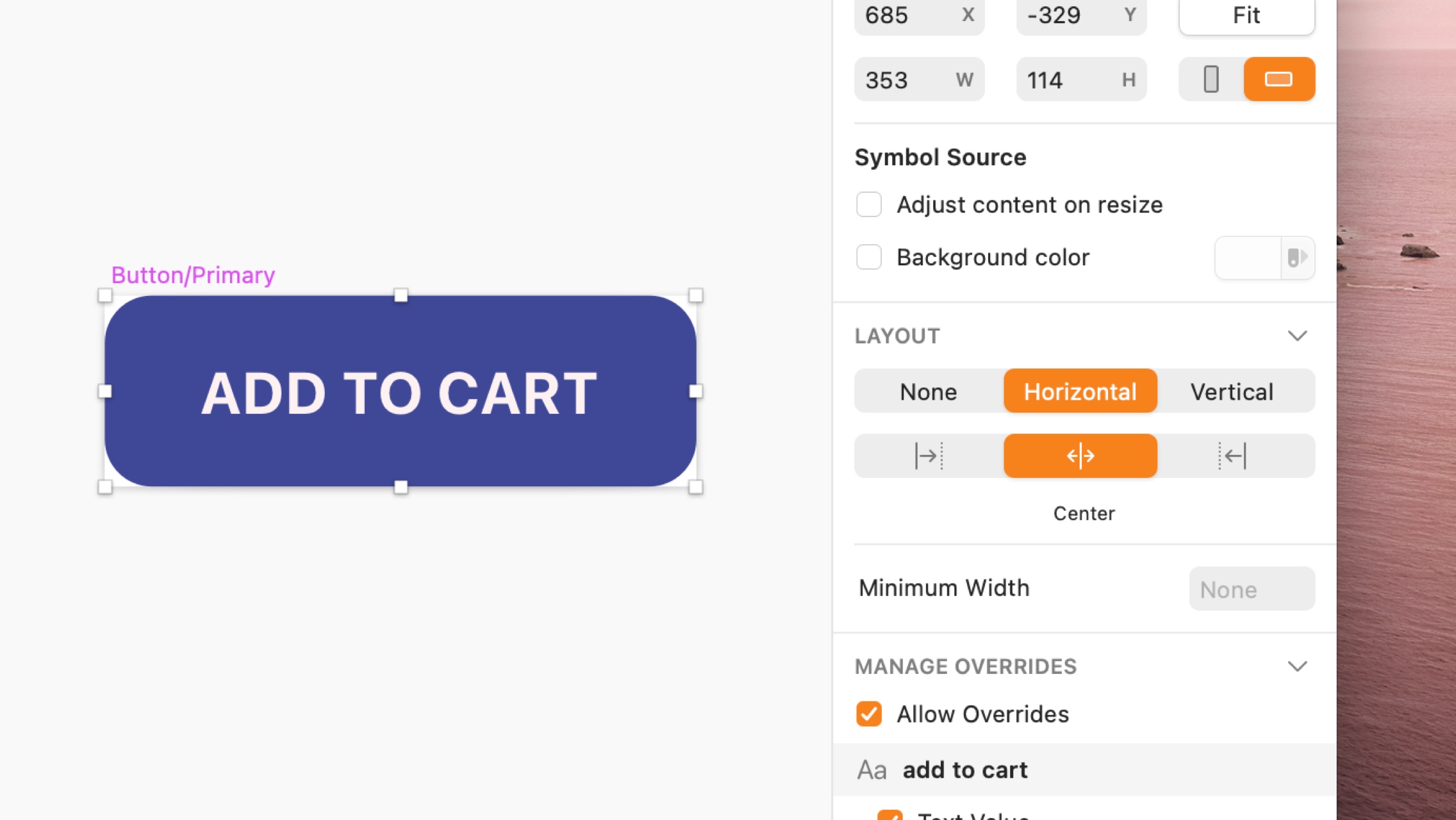
Resizing Symbols with Smart Layout
Smart Layout maintains the padding and spacing between layers in a Symbol when an override changes its size. Once you‘ve set up Smart Layout, changing an override in a Symbol‘s instance will resize it automatically.
A basic button Symbol, set to resize horizontally from the middle.
To use Smart Layout, simply create a Symbol and give it either horizontal or vertical layout. When you create an instance of that Symbol and edit its overrides, Smart Layout will use the spacing and padding between layers in the Symbol Source as a blueprint and keep them consistent in your instance as it resizes.
Note: When you apply Smart Layout properties to a Symbol, you should avoid manually resizing any instances of it. Doing so may cause your Symbol to look or behave unexpectedly. To manually resize a Symbol instance with Smart Layout properties, you’ll either need to detach it or remove those Smart Layout properties from the Symbol Source.
How to use Smart Layout with Symbols
You can set Smart Layout properties in the Inspector (when you edit an existing Symbol Source) or when you create a new Symbol.
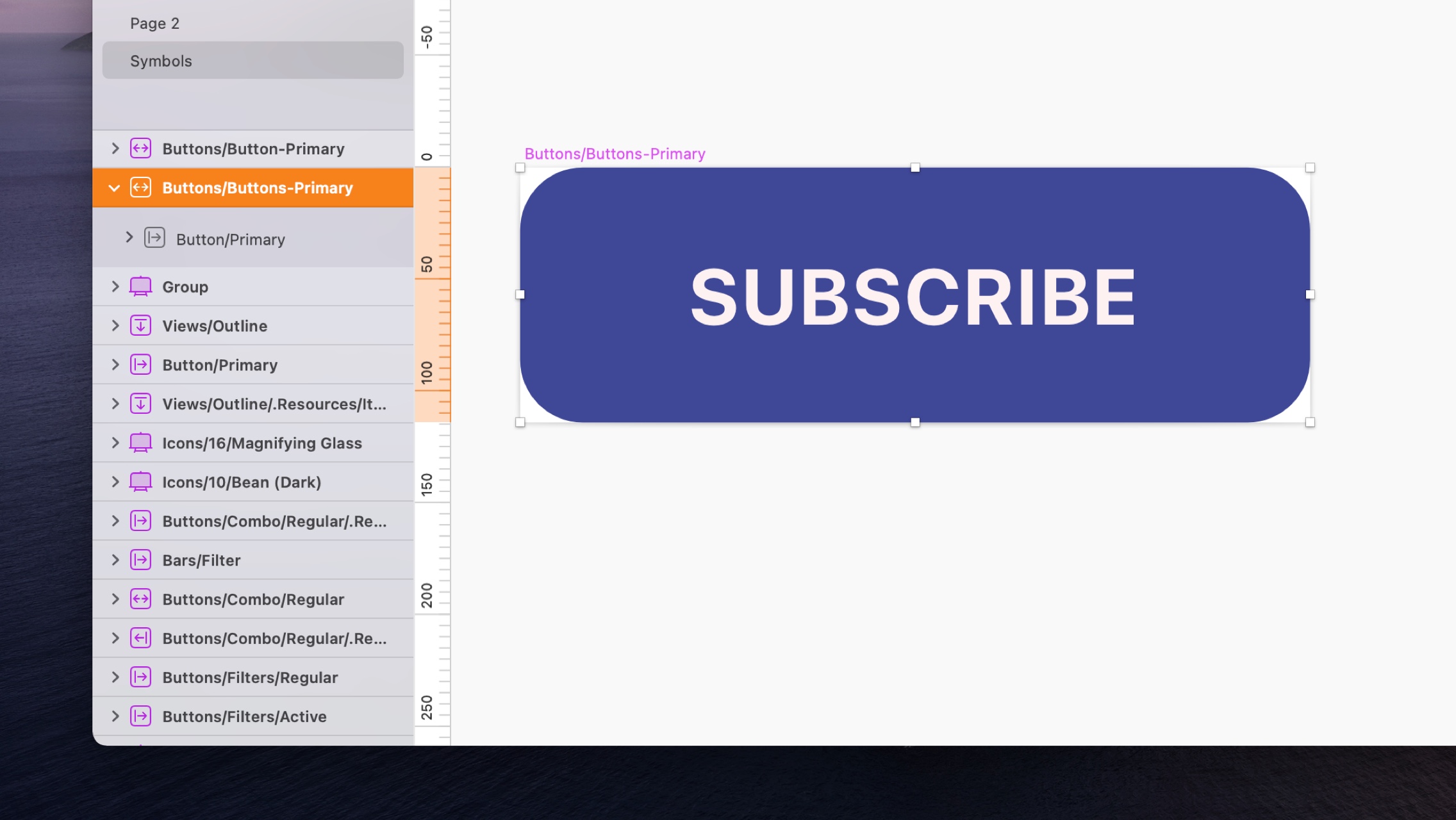
To use Smart Layout with an existing Symbol, head to its Source (you can get there quickly by selecting any instance of that Symbol and pressing Enter on your keyboard) and choose how you‘d like Smart Layout to resize it under the Layout panel in the Inspector.
This Symbol is set to resize horizontally from the middle. Depending on whether you choose a horizontal or vertical layout, the properties row below will show different options.
As well as choosing whether your Symbol resizes horizontally or vertically, you‘ll need to set which direction it resizes from (think of it a bit like text alignment). You can choose from the following layout properties:
- Vertical:
- Top to Bottom
")
- Bottom to Top
")
- From Middle
")
- Top to Bottom
- Horizontal:
- Left to Right
")
- Right to Left
")
- From Center
")
- Left to Right
When you create a new Symbol, you’ll be able set these properties using the drop-down menu underneath the name field in the Create New Symbol sheet.
Note: When you apply Smart Layout properties to a Symbol with text layers, you’ll need to make sure they’re set to either auto height  (for vertical layouts) or auto width
 ") (for horizontal layouts). Smart Layout compares the dimensions of the Text Layer in the Symbol Source to the one in the instance to work out how the other layers in the Symbol should resize, so fixed size text layers will not work as they always stay the same.
(for horizontal layouts). Smart Layout compares the dimensions of the Text Layer in the Symbol Source to the one in the instance to work out how the other layers in the Symbol should resize, so fixed size text layers will not work as they always stay the same.
When you give a Symbol Smart Layout properties, you’ll see a new icon next to its name in the Layer List showing its layout direction.
If you change the layout of a Symbol Source when it already had Smart Layout properties set up, instances of that Symbol may look wrong. To fix this, try clicking the Shrink instance to fit content button that appears under the Overrides panel in the Inspector.
Note: You can still apply Resizing Constraints to layers within a Symbol that has Smart Layout properties. This is handy if you want a specific layer to ignore the layout settings you‘ve given the Symbol it‘s a part of. For example, you can use Resizing Constraints to fix a layer‘s size and stop it from resizing with a Symbol instance that has a horizontal or vertical layout.
How to set minimum Smart Layout dimensions
When you choose Smart Layout properties for a Symbol, you‘ll see a field for minimum height (for vertical layouts) or minimum width (for horizontal layouts) under the Layout panel in the Inspector.
This button’s label is quite short and its Smart Layout settings mean it has resized to be quite small, but setting a minimum width of 90, we can make sure it stays a reasonable size.
Adding dimensions to these fields will stop your Symbol shrinking below a minimum size, regardless of its override content. If you leave these fields blank, your Symbol will shrink to any size to fit its content.
Note: Minimum Smart Layout dimensions are only available in Sketch 62 and above and do not currently apply to groups within Symbols.
How to use multiple Smart Layout properties within a Symbol
For more complex UI components, you might want to include a horizontal layout within a vertical layout (or vice versa), like the example below. For this, you can apply Smart Layout properties to groups within a Symbol Source to have different sets of layers resize in different directions.
This card Symbol has a vertical layout and resizes from the top down. But the two buttons at the bottom are also grouped, have a horizontal layout and resize from right to left.
To do this, open up the Symbol Source, select the objects that you want to resize in a different direction, and group them. Now you can apply a separate set of Smart Layout properties to that group under the Layout panel in the Inspector. Like Symbols themselves, you’ll see a new group icon in the Layer List showing you their layout direction.
If you have a Symbol where one of its layers dictates that Symbol‘s minimum height (like the image in this card example below), applying an override to a shorter text layer next to it would cause the Symbol to resize with unnecessary padding. If that‘s the case, you’ll need to group the text layer(s) and the layer that dictates the Symbol‘s minimum height together in the Symbol Source. Once that‘s done, you‘ll be able override the text layer and Smart Layout will know not to increase the overall Symbol height until the text passes its minimum height.
This card Symbol has a minimum height that‘s dictated by the image layer. By grouping the text layers and image layer together, you can make sure that any text overrides dont cause the Symbol to resize with unnecessary padding.
How to use Smart Layout with hidden Symbols
Smart Layout doesn‘t just work when overrides change the size of a Symbol instance, it also works when you hide a Symbol. For this to work, you‘ll need a set of Nested Symbols that follow the direction of the Symbol Source‘s layout (a row of buttons in a menu with a horizontal layout, for example). Hiding one of those Symbols via the Overrides panel will cause the others to move up and fill the empty spot. This even works for Symbols of different heights and widths.
This navigation menu Symbol has a horizontal layout and a row of button Symbols within it. When one of buttons is hidden using the Overrides menu, the surrounding buttons to move to close the gap.